Design for the a.i. era

Building stronger teams and clearer design leadership for complex products.

Introduction

I help platform teams turn complex product systems into trusted AI and data workflows that users can understand, review, and ship with confidence.
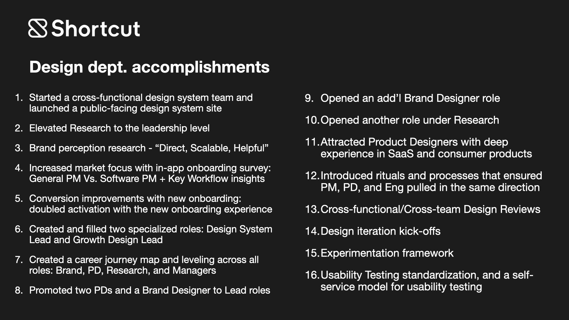
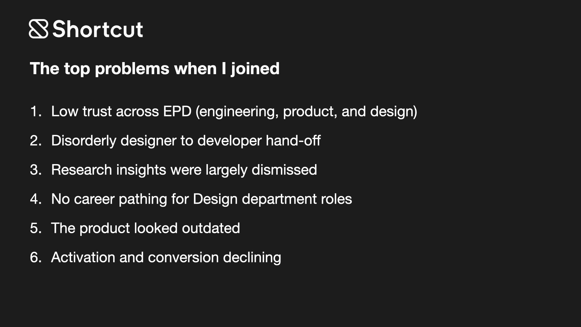
Snapshot

From Platform Complexity to Org Leverage

Leadership Thesis

The shortest version of my work is this: I help teams make complex platforms legible enough for users to trust and structured enough for teams to ship. That usually starts with the same three moves: understand the real workflow, make the risky decisions visible, and turn the best decisions into reusable patterns.

Across infrastructure, collaboration software, and AI-assisted data products, I have learned that product clarity and operating clarity rise and fall together. When users cannot see state, intent, or next steps, teams usually feel the same ambiguity in planning, handoff, and delivery. The work that follows is about fixing both sides of that problem at once.

Leadership Narrative

Career Throughline at Platform Scale

I have spent most of my career in platform environments where the surface area is wide, the user consequences are real, and design has to work across both product decisions and team operating systems. At Pivotal Cloud Foundry, GitLab, Shortcut, and Nexla, the throughline was not one domain. It was one job: make complicated systems easier to navigate, then make the teams behind those systems better at shipping coherent decisions.

That is why my work tends to sit at the intersection of workflow design, systems thinking, and design leadership. I am most useful when the product is complex, the stakes are high, and the team needs both clearer UX and a stronger way of working.

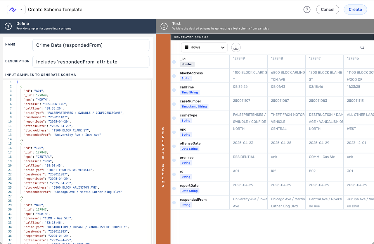
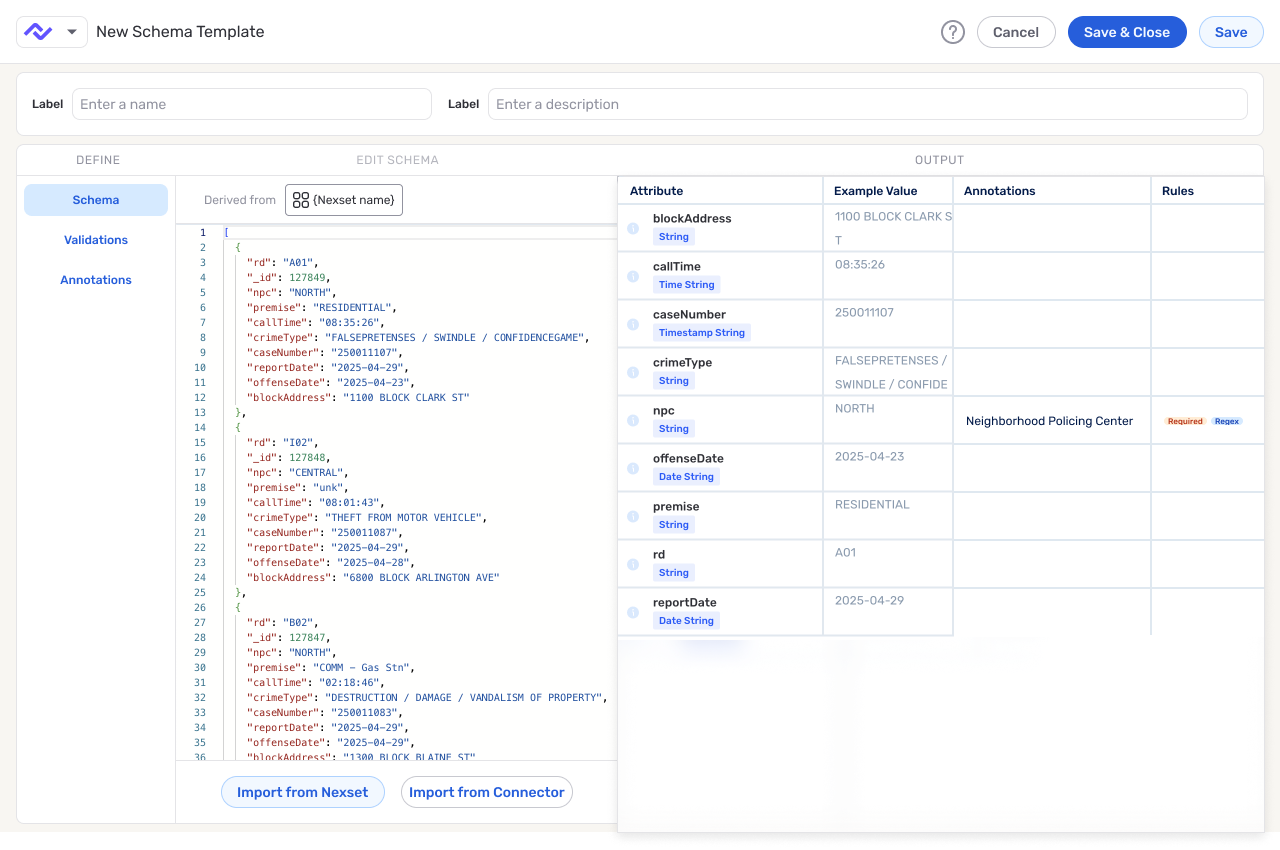
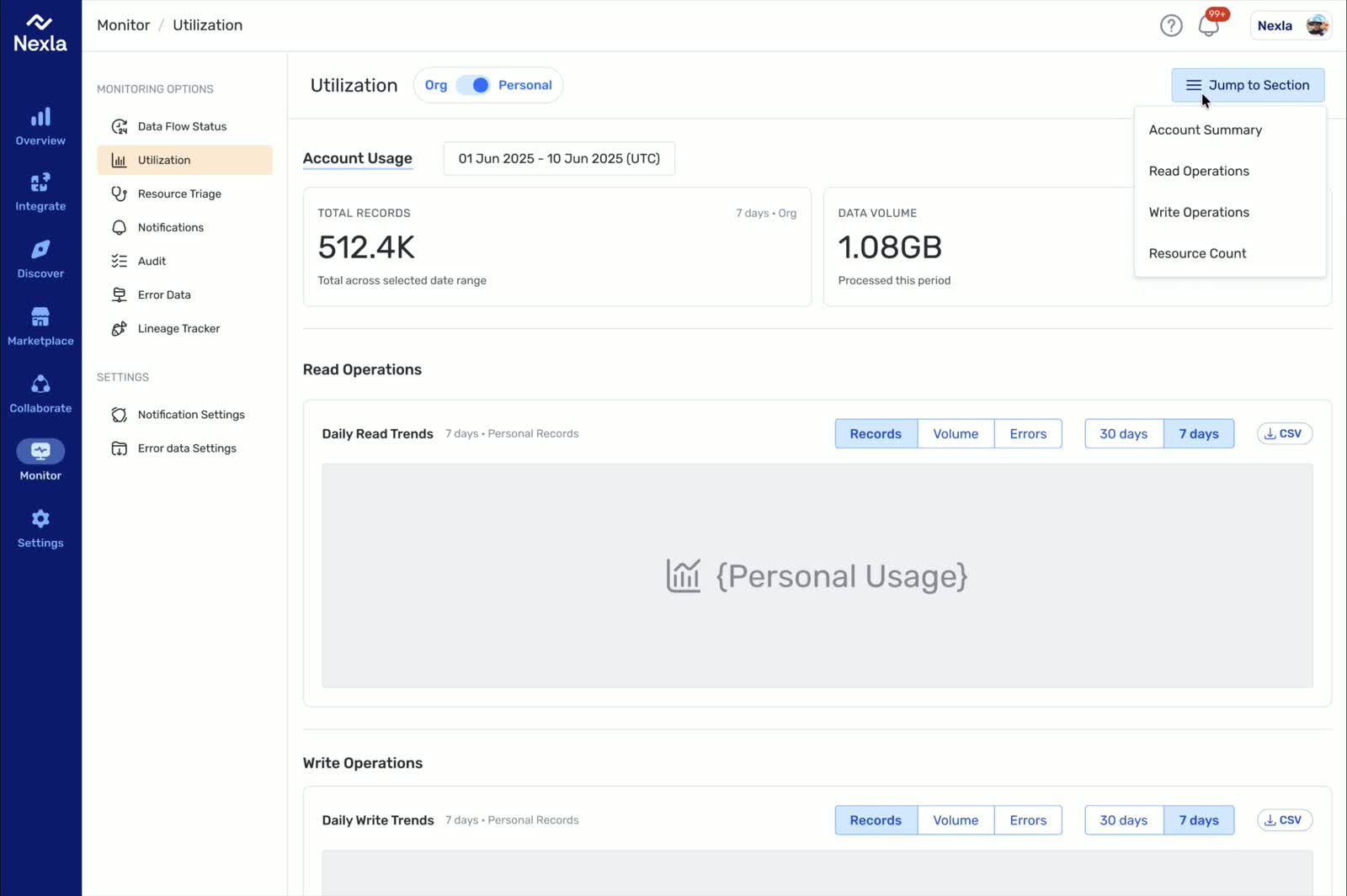
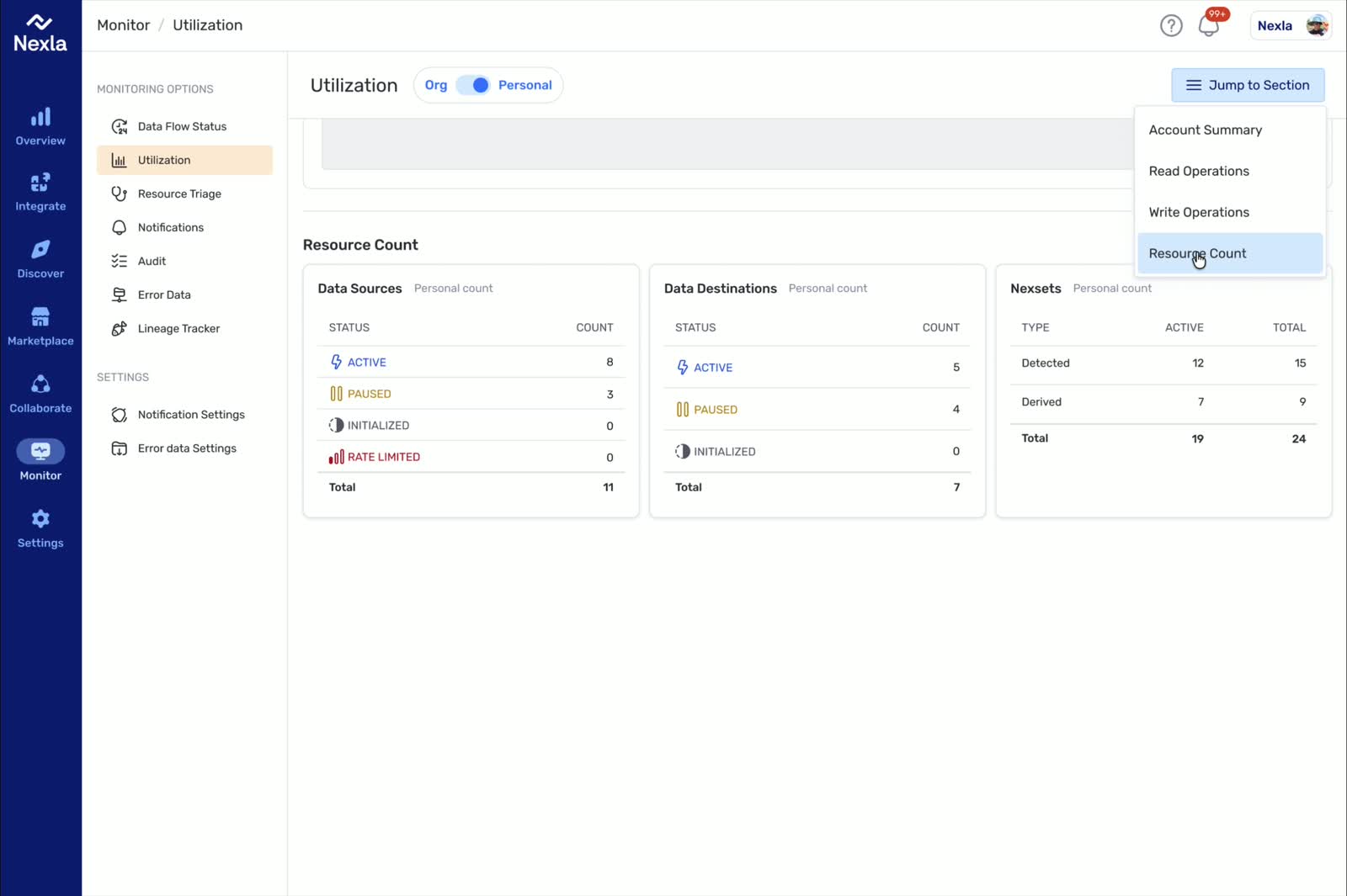
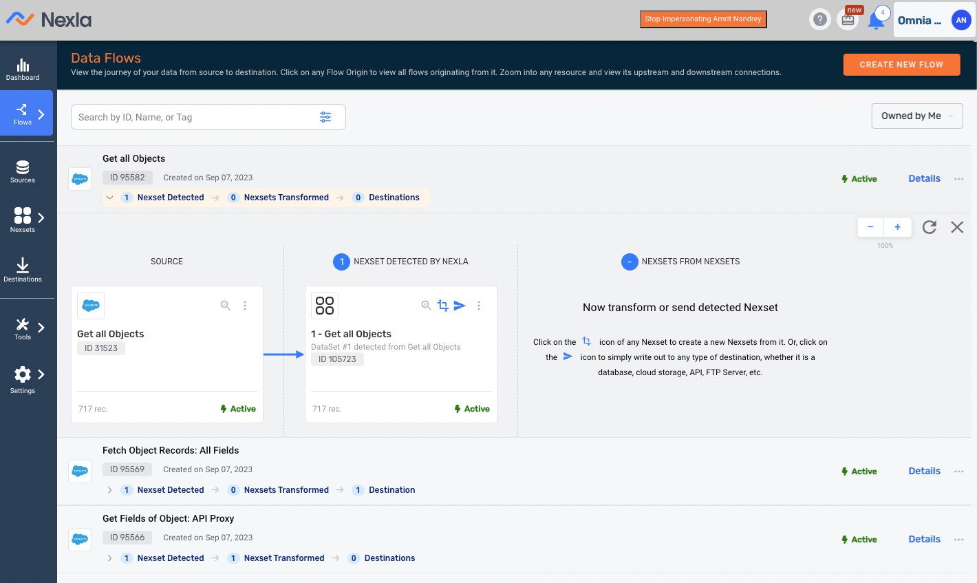
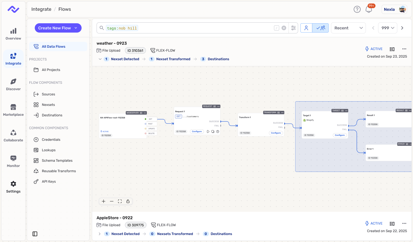
Nexla: Workflows Where Trust Matters

At Nexla, I was the first full-time designer and partnered directly with the CEO and product leadership across more than 50 surfaces. The core challenge was not just interface polish. It was turning connector-heavy workflows into something users could actually review, trust, and recover from when the system hit real-world complexity.

That work included a new 0->1 product, improvements to the core platform, and repeated decisions about how much automation to introduce without hiding the state users needed to see. The result was a clearer workflow model and a stronger design point of view for where AI belonged in the product.

Nexla workflow before redesign
Nexla workflow after redesign

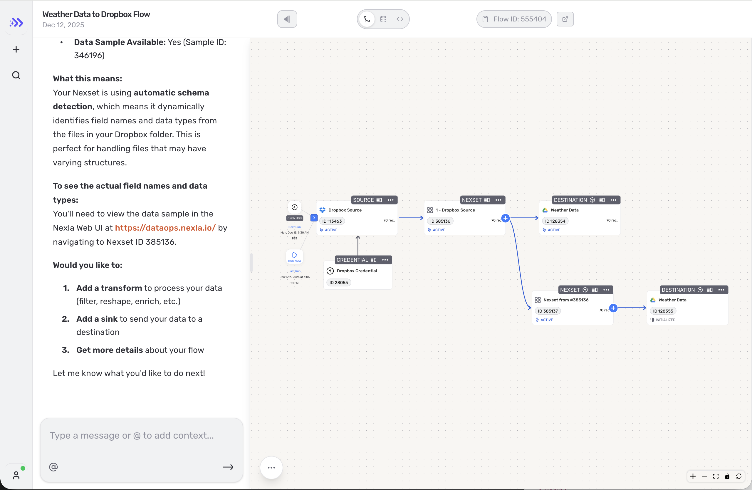
AI Inside the Workflow (Not a Side Chatbot)

The AI pattern I trust most is assistance embedded in the workflow itself. The system can propose a mapping, transform, or next action, but the user still needs to understand what changed, preview the effect, and intervene before anything irreversible happens. In practice, that means propose -> preview -> apply, with guardrails and review points built into the product instead of pushed to the margins.

That distinction matters in enterprise and system-of-record contexts. When mistakes carry real cost, "helpful" is not enough. The workflow has to remain legible, governable, and observable, and the surrounding patterns have to be consistent enough for teams to ship them reliably.

Execution pattern diagram

One Shared Platform Experience Across Two Products

As the product footprint expanded, the design problem expanded with it. I helped unify the core platform and Express.dev so they felt like one company had built them, not two adjacent tools with different standards. That meant defining tokens, components, and workflow patterns for connectors, schema, review states, and execution feedback, then reinforcing them through prototypes, implementation reviews, and shipped changes.

The operating rhythm was part of the design work. Design, code, PR review, feedback, and iteration all had to support the same product language if the experience was going to scale.

Why This Role

The kind of work I am most drawn to sits at the intersection of data complexity, workflow trust, and product systems. I am strongest in environments where advanced capability has to feel legible to users and coherent across surfaces, because that is where design can reduce real risk while improving speed.

That is also why this portfolio centers on trusted workflows rather than isolated screens. The throughline across the cases is consistent: make difficult actions easier to understand, create patterns teams can ship repeatedly, and keep AI assistance grounded in reviewable behavior instead of novelty.

Case Map

Two Proof Cases Behind the Narrative

The two proof cases below show the same leadership pattern from different angles. Express.dev is about AI assistance inside a live workflow: acceleration only works when users can still understand system state, trust the handoff, and recover cleanly. Schema Template Designer shows the same discipline applied to dense product complexity: define a stronger mental model, reduce ambiguity, and turn a partially formed feature into a workflow teams can actually ship.

Together, they show the balance I care about most in platform work: advanced capability without mystery, and better product judgment without slowing delivery.

Schema Template Designer

Reframed schema templates as reusable data contracts so teams could author, preview, and apply them without ambiguous handoffs.

Fast Read

Executive Summary: From Ambiguous Templates to Shippable Contracts

Problem (why this mattered)

  • What changed: Reframed schema templates as reusable data contracts that teams could author, preview, and apply inside the mapping workflow.
  • Why it mattered: The old feature captured field names, but left meaning, validation, and import behavior too ambiguous to trust.
  • Key design move: Defined one contract model - shape, validations, and annotations - then made the apply flow default to unmapped gaps.
  • Outcome: Product and engineering got a shippable create -> preview -> apply workflow instead of another partial template surface.

Summary

Context & Users

When I joined this problem, "schema templates" already existed, but they were not yet functioning like reusable contracts. Teams could capture field structure, but they still had to rely on documentation and tribal knowledge to understand meaning, validations, and what would actually happen when a template was applied.

I reframed the work around a simpler promise: a template should help a team move from create to preview to apply without ambiguity. That shift turned the feature from a loose collection of authoring and mapping ideas into one workflow product and engineering could align on, build, and measure.

Before-state screenshot of schema template workflow issues
After-state screenshot of schema template designer with define, edit schema, and output panes

Problem

The UX debt

Most of the UX debt came from ambiguity, not missing capability. Mapped and unmapped fields were mixed together, calls to action changed meaning depending on context, and authoring still behaved like a sample-driven setup instead of a reusable contract definition tool. On the implementation side, the underlying system was already persisting separate JSON structures, which made it easy for technical complexity to leak into the user experience.

As one Eng/PM partner put it, "There's three separate JSON blobs I'm saving." The result was predictable: operators had to interpret too much before they could trust an import, and contract owners had no clear model for defining rules at scale. The feature existed, but the workflow did not.

System flow from template authoring to template apply and destination

Context

Principles & mental model

This work sat inside NextSet Designer, where two different users had to rely on the same system under deadline pressure. Operators needed a fast, low-risk path to close unmapped gaps. Contract owners needed to define structure, validations, and field meaning in a form that could survive repeated reuse.

As a product lead put it, "We were trying to add garnish... when we were missing a whole side." That constraint shaped the mental model. A template could not be just a list of fields, and it could not split into separate products for authors and consumers. It had to behave like one contract model expressed through two linked workflows.

Contract mental model diagram showing shape, validations, annotations, and contract preview

Approach

Solution 1: apply templates in NextSet

I reduced the design to the smallest set of decisions that unlocked end-to-end usage. First, applying a template should start with unmapped gaps, because that is where the operator's risk and attention live. Second, selection and import states needed to be explicit, so users always knew what was about to happen. Third, rules had to appear close enough to the workflow to teach, not disappear into documentation.

That approach kept the work grounded in real tasks instead of trying to solve every future scale concern in v1.

Horizontal apply flow and simplified after wireframe using BYO diagram styling

Discovery and Evidence

Solution 2: validations at scale

The major tradeoff in reviews was how much validation detail to show inline. An inline model made scanning and one-click import faster, which mattered in the mapping flow. A tabbed model would scale better as rule density increased, but it also risked pushing essential context out of sight too early.

I chose to ship the inline model for v1 because the immediate problem was not information overload; it was decision confidence. The fallback was deliberate: if teams later outgrew inline presentation, tabs were a scale strategy, not a prerequisite for shipping.

Model A inline table and Model B tabs wireframe comparison with decision strip

Solution

Solution 3: author templates

The final interaction model treated authoring as three inputs feeding one trusted preview. Shape came from sample data or pasted JSON. Validations could be defined through guided controls or JSON. Annotations captured field meaning so downstream users could understand intent, not just structure.

On the apply side, the workflow kept operators focused on unmapped fields first, made bulk selection predictable, and clarified import states before changes landed. Together, those moves made the template behave like a reusable contract instead of an ambiguous helper.

After-state screenshot of schema template designer with define, edit schema, and output panes

Implementation

I translated the interaction model into implementation-ready behavior: defaults, state transitions, edge cases, and the minimum contract needed across authoring and apply. That gave engineering a clearer handoff than a set of isolated wireframes and helped keep scope centered on the core loop instead of garnish work.

Just as important, the spec preserved room for growth without bloating v1. Guided and JSON-based authoring mapped to the same underlying contract model, and the apply flow left a clear path for future scaling decisions such as denser rule navigation and governance signals.

Results

Outcome and evaluation plan

The redesign produced a more legible path from authoring to valid output. Product and engineering now had a shared model for what a schema template was supposed to do, and users had a clearer workflow for moving from definition to application. The work turned an idea that had been partially defined in multiple places into a workflow that could actually be reviewed, implemented, and measured.

I would evaluate success through time to valid output, select-to-import conversion, post-import edits, and support signals. Those metrics matter because they reflect the underlying goal of the redesign: fewer ambiguous handoffs and fewer mapping incidents caused by unclear contract behavior.

Reflections

Learnings & next steps

The project reinforced a pattern I rely on often: when a feature is struggling, the right response is not always more surface area. Sometimes the faster path is to narrow the promise, define a stronger mental model, and make the defaults do more of the teaching.

If I took this further, the next step would be usability testing with operators using real templates, followed by scaling work around governance and denser validation management. But the core lesson would stay the same: create -> preview -> apply is the handoff that makes the whole system usable.

Appendix

Artifacts worth linking here later: the contract mental-model diagram, the inline-vs-tabs validation comparison, authoring workflow screens, and the implementation-ready behavior spec covering defaults and edge cases.

Design Org Foundations

Built the design organization's first shared ladder and performance framework, giving managers and designers a clearer model for growth, coaching, and partnership.

Fast Read

  • What changed: Built shared career ladders across product design, brand, and research, then turned them into a usable performance and coaching framework.
  • Why it mattered: The team had strong people, but no consistent way to define growth, calibrate expectations, or repair weak product/design partnership.
  • Leadership move: Created one common language for scope, craft, and leadership, then tested it in real manager conversations instead of treating it like a static document.
  • Outcome: Designers had clearer growth paths, managers had a more reliable coaching tool, and cross-functional trust had a stronger foundation because expectations were easier to see and discuss.

Summary

I was brought into the organization during a period of growth when design needed stronger foundations, not just better output. The immediate challenge was to create clear career paths across product design, brand, and research while also rebuilding trust between design leadership and partner functions.

I led the creation of a shared ladder and performance framework so expectations were explicit, comparable across disciplines, and usable in actual coaching and calibration conversations. The value of the work was not that it produced a polished framework document. It gave the team a practical operating model for growth, promotion readiness, and a better foundation for product partnership.

Design department accomplishments slide showing design system team, research leadership, brand perception research, onboarding survey, specialized roles, rituals, and experimentation

Problem

The organization had talented designers, but it did not yet have a shared way to talk about level, growth, or cross-disciplinary expectations. Managers were being asked to evaluate scope, craft, and leadership without a common language, which made calibration inconsistent and made advancement harder to explain or defend.

That ambiguity affected more than performance cycles. It also weakened product/design partnership because unclear expectations tend to create unclear ownership, uneven feedback, and lower trust in how decisions get made.

Shortcut problem slide listing low trust, hand-off issues, dismissed research, no career pathing, outdated product, and declining conversion

Context

The team was already shipping work across product, brand, and research, so the answer could not be a long internal strategy exercise detached from delivery. Any new framework had to work while the organization was still moving, and it had to support both managers trying to coach well and designers trying to understand what growth actually looked like.

That created the central constraint for the work: move quickly enough to help the team now, but build something durable enough to support future hiring, compensation, and promotion conversations.

Approach

I started by defining a shared set of principles for how the organization should talk about scope, craft, and leadership, then translated those into discipline-specific expectations for product design, brand, and research. The point was not to build a perfect framework on paper. It was to create language managers could use immediately in one-on-ones, feedback, and calibration.

I pressure-tested the model with peer leaders and coaching networks to make sure the ladders were clear without inflating titles or creating discipline-specific silos. That kept the framework practical and made adoption more likely once it moved into real use.

The 2.0 prototype proved we could simplify the surface, but critique also showed how little reusable brand structure we had. That pushed the work beyond cleaner screens toward a system the team could actually repeat.

2.0 prototype comparing the old Shortcut app with a cleaner refreshed directionShapes design-system sheet showing reusable icons and brand forms that resolved the sparse prototype direction

Discovery and Evidence

Reviewing manager notes, feedback patterns, and recurring confusion in growth conversations made the root issue clear: similar impact was being described differently depending on whether the work came from product design, brand, or research. That made fair calibration harder and weakened confidence in the system.

Cross-functional conversations also showed that product/design friction was partly structural. Without a shared model for scope and accountability, teams defaulted to local interpretations, which increased misalignment. The product visuals in this case should be framed as supporting evidence of that broader alignment problem, not as standalone proof that the ladder work caused each product change.

Solution

The final system had three linked parts: ladders tailored to each discipline, a shared competency model that made levels easier to compare, and a performance framework that turned those expectations into usable coaching language. We mapped scope, collaboration, and leadership behaviors in a way managers could actually apply across teams.

Just as important, I connected the framework to a regular coaching rhythm. That made the work operational instead of ceremonial. The ladders were not just there to explain promotions. They became a tool for feedback quality, development planning, and a clearer basis for product/design partnership.

Shortcut slide showing team focus and scalable navigation with side-by-side product views

Implementation

I rolled the framework out iteratively rather than treating it like a top-down announcement. Early drafts went through managers and designers first, because the test was whether the language held up in real conversations, not whether it looked complete in a presentation.

Within about the first month, we had a usable version with enough buy-in to support live coaching and calibration. From there, the work shifted from definition to adoption: tightening unclear wording, using the model in performance discussions, and reinforcing the same expectations in cross-functional planning.

Results

The organization came away with a more credible growth system across product design, brand, and research. Designers had clearer visibility into what advancement required, and managers had a more consistent tool for coaching, calibration, and promotion readiness.

Outcomes

The framework also gave product and design leaders a clearer basis for discussing expectations, ownership, and collaboration. That does not prove partnership was fully fixed on its own, but it created a stronger foundation for better decision-making across the org.

Reflections

The biggest lesson was that org-design work needs the same discipline as product work: clear problem framing, iterative testing, and explicit tradeoffs. A framework that managers actually use is more valuable than a theoretically complete model that arrives too late or feels detached from the realities of delivery.

If I revisited the work, I would add stronger adoption measurement earlier so future revisions could be driven by evidence instead of manager anecdotes alone. But the core decision would not change: start with clarity people can use now, then scale the system once trust is established.

Express.Dev Generative UI

Shaped a prompt-first flow authoring experience that kept AI assistance useful without hiding state, confidence, or the path back to manual control.

Fast Read

  • What changed: Designed a prompt-first flow authoring experience where an agent could accelerate setup without hiding the underlying workflow.
  • Why it mattered: Generated UI was only useful if users could understand what the system was doing, trust the next step, and recover cleanly when automation failed.
  • Key design move: Treated the work as an interaction-contract problem - constrain the agent's behavior, expose system state, and make fallback to manual editing explicit.
  • Outcome: The team had a clearer model for trustworthy generative UI and a stronger foundation for expanding AI-assisted workflow creation.

Summary

This case is about defining a trustworthy interaction model for AI-assisted flow creation inside a real workflow product. The goal was not to make the experience feel magical. It was to make prompt-first setup genuinely helpful while preserving the visibility and control technical users needed when credentials, connectors, or generated steps became unreliable.

I helped define how generated forms, quick actions, and credential prompts should behave so users could understand what the system was asking, why it was asking it, and when to stay in the guided path versus move to the canvas for manual control.

Express.Dev flow canvas in light mode
Express.Dev flow canvas in dark mode

Problem

Prompt-first authoring lowered the barrier to getting started, but it also created a new trust problem. When credentials failed, generated steps stalled, or connector behavior was inconsistent, users had too little context to tell the difference between a recoverable issue and a broken path.

That made the product feel asymmetrical: fast when the happy path held, but opaque when reality intruded. For a workflow product, that is a serious issue. Users do not just need acceleration. They need a reliable way to understand state, make the next decision, and recover without starting over.

Context

The experience was powered by an XML DSL that let the agent generate interface components on the fly. That flexibility was powerful, but it also meant the product needed a stronger interaction model than a traditional handcrafted flow. Without clear constraints, generated forms and actions could vary in ways that felt unpredictable or hard to trust.

The design challenge was to support two legitimate user needs at once: a guided path for people who wanted to move quickly through prompts, and a reliable escape hatch for people who needed the precision of direct canvas editing.

Approach

I treated the work as an interaction-contract problem. The agent could only be useful if the product constrained what it could ask for, clarified the role of each generated component, and defined what happened when the guided path no longer had enough confidence to proceed.

That meant focusing reviews on progressive disclosure, explicit next-step language, clearer credential selection, and predictable retry behavior. Instead of asking, "How do we make the AI feel smarter?" the more useful question became, "How do we make the workflow feel more trustworthy?"

Discovery and Evidence

The strongest signal from transcripts and reviews was that users responded well when the generated steps felt concrete and inspectable, but their confidence dropped quickly when backend conditions became imperfect. Credential validity, action sequencing, and unresolved sync states all created moments where the product needed to say more than it currently could.

Those findings made it clear that the failure mode was not simply "AI made a bad suggestion." The deeper issue was that the interface was not always telling users what kind of situation they were in, what level of confidence they should have, or what the safest next move was.

Solution

The solution preserved the speed of prompt-first authoring while making system intent more visible. Generated forms and quick actions stayed central, but they were framed as part of a reviewable workflow rather than as opaque AI output. Users could see what the system was asking, why it mattered, and when the guided path was no longer the right tool.

Most importantly, fallback became explicit. Instead of treating manual editing as a hidden escape route, the design made the handoff to the canvas a normal and trustworthy part of the experience. That let the product keep the benefits of AI assistance without forcing users to bet everything on it.

Implementation

I partnered closely with engineering around the reliability moments most likely to shape user trust: credential selection, recoverable failure states, and completion signals that stayed honest when the backend still had unresolved work. The implementation goal was not to promise more automation. It was to make the assisted path dependable under real connector constraints.

That required discipline in both product language and interaction behavior. We prioritized the states the team could defend, clarified the points where user control resumed, and avoided design decisions that would make the system feel more capable than it really was.

Results

The most user-facing result was a clearer setup experience. Users got better signals about what the assistant was doing, where their control resumed, and how to proceed when the guided path stopped being the best option.

Outcomes

For the team, the work also established a more credible baseline for future AI-assisted workflow work because it tied automation to visible state, explicit handoff, and recoverable behavior instead of relying on novelty alone.

Reflections

The main lesson was that trust in AI-assisted workflows comes from predictable interaction contracts, not from maximizing autonomy. Users are more willing to use automation when the system is honest about state, clear about confidence, and explicit about how control returns to them.

That principle is reusable well beyond this case. In AI-heavy products, the best design move is often not to add more intelligence. It is to make the existing intelligence easier to understand, evaluate, and recover from.

Appendix

Useful supporting artifacts for the live case later: annotated transcript excerpts, review notes on credential reliability and action sequencing, fallback-state explorations, and examples of generated UI versus manual canvas handoff behavior.

Overview Dashboard Enhancements

Redesigned a fragmented overview dashboard into a clearer page-level control model with stronger wayfinding and honest scope boundaries.

Fast Read

  • What shipped: Reorganized the overview dashboard around one page-level org or personal switch, clearer section hierarchy, and scalable navigation
  • Problem: The original dashboard repeated org versus personal toggles inside individual sections, took up significant space, and still left the page feeling sparse and fragmented
  • Primary audience: Workspace admins and operators onboarding sources, flows, and team setup
  • Secondary audience: Product and engineering partners validating dashboard clarity and ship readiness
  • Operators: Support and onboarding stakeholders helping teams activate accounts
  • My role: Design lead driving interaction decisions, decision documentation, and implementation alignment
  • Timeframe: Q4 2025
  • Constraints:
    • Chart redesign was out of scope, so large gray panels remained placeholders for future reporting work
    • Implementation needed to ship within existing dashboard architecture rather than wait for a broader analytics rewrite
    • The redesign needed to support future scale without introducing more section-specific controls
  • In scope:
    • Global org versus personal mode selection
    • Dashboard hierarchy, sectional clarity, and wayfinding for a growing set of overview modules
    • Export affordances for teams needing CSV access from existing views
  • Out of scope: Chart redesign and deeper analytics system changes

Summary

I led a focused redesign of Nexla's overview dashboard to replace a fragmented section-by-section control model with a clearer page-level mental model. The work consolidated org versus personal context into a single toggle, tightened the hierarchy of the page, and introduced scalable navigation patterns without overextending into chart redesign that the project could not support in the same pass.

Problem

The original dashboard asked users to re-interpret context in every module. Separate org and personal toggles appeared across sections, there was no clear page-level mode, and the layout consumed a large amount of space without delivering corresponding clarity. Review feedback made the issue plain: people could read the cards, but the structure of the page did not explain itself.

Previous overview page: local toggles and section-by-section controls made the page model feel fragmented instead of establishing one clear context up front.

Previous overview page with repeated local toggles and a fragmented page model instead of one clear page-level context switch.

Context

The team needed a redesign that could ship on top of the existing overview framework while leaving room for the dashboard to grow. That meant making the current page easier to understand immediately, but also introducing navigation and structure that would still work once more overview sections and reporting surfaces were added.

Approach

I treated the problem as a structural redesign rather than a cosmetic cleanup. The main move was to centralize org versus personal context at the page level, then clarify the rest of the dashboard around that choice. From there, the work focused on making the overview easier to scan, planning for more sections through a jump menu, and keeping scope disciplined where the project was not actually redesigning chart content.

Redesign baseline: one page-level Org and Personal mode control replaced repeated local switches and gave the whole page a more coherent structure.

Redesigned overview page with a single page-level Org and Personal toggle plus CSV export controls within the section modules.

Discovery and Evidence

The recording-backed walkthrough clarified the strongest design signals. The old page lacked a global toggle, felt spacious but low-information, and forced users to re-learn the same context rules in each section. The redesign commentary also made the intended scope explicit: charts would stay as placeholders for now, while the team concentrated on page structure, navigation, and high-value utility actions like CSV export.

Solution

The shipped dashboard establishes org versus personal mode once, at the top of the page, then lets the rest of the modules inherit that choice. It also introduces a jump-to control so the dashboard can scale without becoming a long stack of unrelated cards. Where reporting depth was not part of the redesign, the layout uses placeholders honestly instead of implying that chart behavior had already been solved.

Scalable navigation: the Jump to Section menu makes future dashboard growth legible without falling back to repeated local controls.

Redesigned overview page with the Jump to Section menu open to show scalable navigation across summary, read, write, and resource modules.

Implementation

Design and engineering aligned around a narrow set of decisions the team could actually defend in implementation: centralize the page mode switch, improve wayfinding, preserve placeholder chart regions where redesign work had not happened, and add CSV downloads where operators would benefit from extracting data. That balance kept the redesign useful and shippable without hiding unresolved analytics work.

Concrete destination: the Resource Count section shows how the new navigation model lands users in a specific part of the overview instead of leaving the page as one long undifferentiated stack.

Redesigned overview page landing in the Resource Count section after section navigation, showing concrete destination-level detail for the new overview model.

Results

The redesign gave the overview dashboard a clearer mental model and a more scalable structure. Users no longer had to decode org versus personal context section by section, and the page could accommodate future growth through explicit navigation instead of repeated local controls. Just as importantly, the final design drew a clean line between what was redesigned now and what remained future chart work.

Outcomes

  • Replaced repeated section-level org versus personal switches with a single page-level mode model
  • Added a jump-to navigation pattern so the dashboard can grow without losing structure
  • Kept chart redesign out of scope while still adding practical CSV export paths for operators

Reflections

The most useful decision was to solve the conceptual model first. A dashboard does not become clearer by adding more local controls or filling space with low-confidence reporting. Centralizing context, clarifying hierarchy, and naming scope boundaries explicitly made the redesign stronger than trying to make every part of the page feel finished at once.

Appendix

Follow-up items include chart redesign, richer reporting behavior, and any additional overview sections that the jump-to pattern will eventually need to support.

Flow Creation Improvements

Reworked flow creation around user intent so teams could start setup with clearer next steps and less early-stage confusion.

Fast Read

  • What shipped: Redesigned flow creation to reduce early-step confusion and improve completion confidence in Nexla
  • Problem: Users had to choose a flow type before understanding their goal, creating friction and abandonment
  • Primary audience: DataOps practitioners configuring ingestion and transformation flows
  • Secondary audience: Engineering managers and solution architects reviewing implementation feasibility
  • Operators: Support and onboarding teams guiding setup
  • My role: Design lead defining interaction model, sequencing, and decision rationale
  • Timeframe: Q4 2025
  • Constraints:
    • Existing backend contracts with multiple flow types could not be rewritten in one release
    • Team operated with parallel PRs and limited QA capacity
    • A11y and role-based actions had to remain intact in current UI patterns
  • In scope:
    • Flow creation entry and decision sequence
    • Onboarding states and action affordances in flow setup
  • Out of scope: Deep backend re-architecture of all flow type orchestration

Summary

I led a redesign of flow creation entry so users could orient around the next meaningful action instead of internal flow taxonomy. The work focused on reducing cognitive load in the first-run journey and improving confidence in setup decisions.

Problem

The product asked users to pick a flow type too early. Team conversations showed that users wanted to connect to systems first and only then handle flow-specific details. This mismatch caused confusion in onboarding and slowed setup completion.

Context

The platform supported multiple flow types with different backend and wizard behaviors. Some flow paths were still half-baked and exposed to users. The team needed to reduce user-facing complexity without hiding product power.

Approach

We iterated toward a task-first sequence: make the initial call to action map to user intent, then defer flow-type complexity to later steps. We used low-cost, component-reuse changes for fast feedback while preserving backend compatibility.

Discovery and Evidence

Weekly team reviews captured recurring confusion around early flow-type decisions and metric ambiguity. We used those reviews to scope pragmatic interim metrics and identify user-facing copy and action mismatches.

Solution

The revised interaction model introduced clearer resource cards, simpler call-to-action mapping, and permission-aware actions. We preserved visibility for non-admin users while gating actions they could not execute.

Implementation

Design and engineering reviewed edge cases in active/paused state semantics and reconciled API limitations with product language. We treated missing metrics as explicit scope cuts and documented follow-up work.

Results

The shipped iteration reduced conceptual overhead in onboarding by aligning screen language to user goals. It also created a foundation for later modal/dropdown flow creation patterns without blocking delivery.

Outcomes

  • Reduced early-step confusion by shifting flow complexity later in the journey
  • Improved action clarity in onboarding and resource management surfaces
  • Created a safe path for iterative rollout with existing backend contracts

Reflections

The biggest lesson was sequencing: ask users to make the easiest high-confidence choice first. I would keep the low-risk incremental rollout and improve instrumentation earlier in the project.

Appendix

Appendix materials can include glossary terms for flow states and implementation notes for follow-on instrumentation and analytics.

agent-memory-mcp

Built a shared local memory layer that lets Codex, Claude Code, and other MCP clients reuse durable project context across sessions.

Snapshot

agent-memory-mcp started as a practical fix for a recurring workflow problem: every local agent session could reason well in the moment, but useful context kept fragmenting across tools and threads.

The project turns that into a shared local memory layer so multiple MCP clients can retrieve durable context without forcing teams into a single editor, host app, or orchestration shell.

Context

This sits in the part of the workflow most agent tools currently skip over: durable project memory that survives beyond a single session and can be reused across different local clients.

For the people actually using Codex, Claude Code, and similar tools day to day, the gap was not raw model quality. It was the cost of reestablishing context every time they changed threads, tools, or tasks.

Problem

  • Local agent workflows were fast, but project memory was trapped inside whichever tool happened to be active.
  • Repeated prompts recreated the same context instead of compounding on prior decisions, constraints, and repo facts.
  • Teams needed something local-first and inspectable, not a black-box hosted memory service bolted onto one client.

Build

Shared local memory layer

  • Scoped memory capture keeps repo facts, decisions, and user preferences retrievable without mixing unrelated work.
  • SQLite storage keeps the system local, portable, and easy to reason about during development.
  • MCP-native tools handle capture, search, dedupe, and upsert so different agent clients can participate without custom glue per app.
Overview diagram from agent-memory-mcp showing Codex, Claude Code, and other tools sharing a local MCP memory layer.

Impact

  • The project turns memory from client-local residue into a shared working layer that can actually compound across sessions.
  • Designing for multiple agent clients forced the system toward clearer contracts, explicit scoping, and a local-first storage model.
  • As a Labs pilot, it also proved this work reads better as a case study when the narrative ties infrastructure choices directly to workflow outcomes.

Repository: github.com/mikeylong/agent-memory-mcp

codex-toolbar

Built a macOS menu bar utility that makes Codex rate-limit state visible at a glance and turns the next action into a one-click decision.

Snapshot

codex-toolbar is a small macOS menu bar utility for people who use Codex enough that rate limits become part of the working environment, not an occasional surprise.

The goal was simple: make the current limit state visible at a glance, then make the next useful action immediate instead of requiring another round-trip through the CLI or desktop app.

Context

Frequent Codex use creates a background coordination problem. You need to know whether you still have room in the current window, whether the tightest limit is about to reset, and whether it is worth staying in the flow or pausing.

The local README makes the product constraint clear: this had to live as a real macOS utility, not a demo surface. It needed to run as an app, refresh reliably, and fit naturally into the menu bar habits of daily desktop use.

Problem

  • Rate-limit state was available, but not ambient. Users had to interrupt themselves to check it.
  • The cost of checking was out of proportion to the decision: open the app, inspect the limit state, then decide whether to continue.
  • Once the state was visible, there was still friction getting back into Codex quickly enough for the signal to be useful.

Build

Popover states across the rate-limit curve

The popover needed to make the most constrained window legible enough that normal, warning, and critical states felt immediately different without becoming visually noisy.

Productize the everyday utility

  • Show a compact menu bar progress bar for the most constrained Codex window, including multi-week windows.
  • Open a popover with remaining percentages, reset timing, and an Open Codex action when the desktop app is installed.
  • Refresh automatically on system clock minute boundaries and support manual refresh from the right-click menu.
  • Ship as a real .app with launch-at-login support so it behaves like an everyday desktop utility instead of a dev-only helper.

Impact

  • The product turns limit awareness into a glance instead of a workflow interruption.
  • It closes the loop from signal to action by pairing ambient status with a direct route back into the Codex desktop app.
  • As a Labs case, it shows how a very small utility can still benefit from explicit product framing, state design, and enough polish to feel durable.

Repository: github.com/mikeylong/codex-toolbar

Website: codextoolbar.com

SkillSkill

Turned successful AI workflow sessions into reusable skill packages with explicit routing, output contracts, and validation across Codex and Claude.

Snapshot

SkillSkill came from a familiar failure mode in AI-assisted work: one session would finally produce a strong workflow, but the next person still had to reteach the same job from scratch.

The project turns that tacit know-how into a reusable skill package with a clear trigger, contract, edge cases, and example requests so the workflow can route and perform more consistently the next time it appears.

Context

Strong AI workflows rarely depend on the task statement alone. The useful part is usually the hidden discipline around what to include, what to exclude, how to structure the output, and how to handle messy inputs.

That knowledge is easy to discover in one good session and surprisingly hard to reuse afterward. Prompt snippets help, but they do not reliably tell an agent when a workflow should trigger or what a correct result must look like.

Problem

  • Good one-off sessions produced tacit instructions, not durable workflow assets.
  • Ad hoc prompts did not make routing or output expectations explicit enough for repeat use.
  • Cross-tool reuse was brittle when core method and platform-specific packaging details were mixed together.

Build

Package the workflow, not just the prompt

  • Write a canonical SKILL.md around routing description, contract, workflow, edge cases, and example requests.
  • Keep the method cross-tool by default, then add Codex or Claude packaging only when the caller actually asks for it.
  • Support create, revise, and critique paths so weak skills can be repaired instead of abandoned.

Add validation and packaging discipline

  • Ship a dependency-free validator that checks required files, one-line descriptions, contract coverage, examples, and packaging drift.
  • Include rubric and review-checklist references so quality expectations stay inspectable instead of living only in the author's head.
  • Add install scripts and committed package mirrors so the same skill can be reused across local Codex and Claude setups.

Impact

  • The project turns a good AI workflow session from ephemeral chat residue into a durable asset teams can reuse and critique.
  • It makes routing and output expectations explicit enough that repeated work compounds instead of starting from a longer prompt every time.
  • As a Labs case, it shows that productizing AI workflow knowledge often means adding contracts, validation, and packaging clarity, not more prompt cleverness.

Repository: github.com/mikeylong/SkillSkill